How to Choose the Right Shades for Your Living Room
Let’s be real—choosing colors for your living room shouldn’t feel like you’re defusing a bomb. Yet somehow, standing in front of a wall of paint swatches makes us question every life decision. Is beige too safe? Will navy make the room feel like a cave? Why are there 37 shades of white? If you’ve asked yourself any of these questions, welcome to the club—you’re in the right place.
I’ve made enough questionable living room color decisions to confidently say: picking the right palette is less about “what’s trending” and more about how you want the room to feel. So, let’s break this down the easy way—like we’re chatting over coffee and judging each other’s paint choices with love.

Why Your Living Room Color Palette Actually Matters
Your living room sets the tone for your entire home. It’s where you relax, entertain, scroll aimlessly on your phone, and pretend to watch TV while actually browsing Pinterest. The colors you choose affect everything—mood, lighting, even how tidy your space looks.
The right color palette can:
- Make a small room look bigger
- Add warmth without cluttering the space
- Highlight your furniture and decor like a pro stylist did it
- Hide dust when you don’t feel like cleaning (we’ve all been there)
So yes, color matters. A lot.

Start With Mood: What Do You Want the Room to Feel Like?
Before you obsess over hex codes and paint chips, ask yourself: What vibe am I going for here?
Cozy and Warm
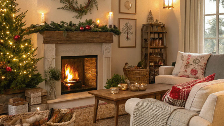
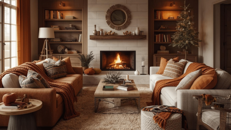
If you want your living room to feel like a hug, go for warm tones like terracotta, caramel, muted mustard, or soft earthy beige. These tones add depth without overwhelming the space.
Fresh and Airy
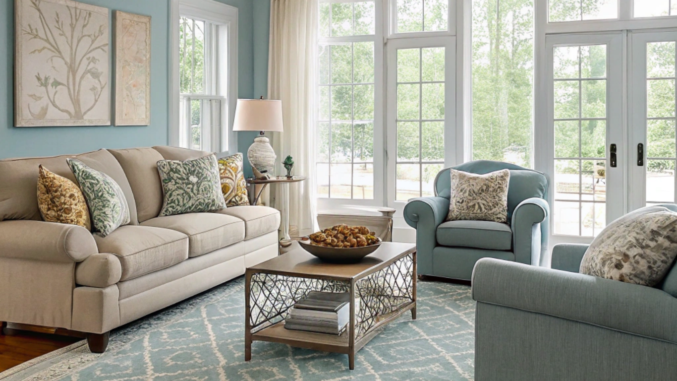
Want that light, “I clean my house even when no one is visiting” aesthetic? Cool tones like sage green, sky blue, soft gray, and off-white do the trick beautifully.
Bold and Dramatic
If you secretly wish your home looked like a Pinterest board titled “Moody Modern Chic,” embrace deep jewel tones like emerald, charcoal, or navy. Pair them with metallic or wood accents to keep things balanced.
Quick tip: If you can’t commit, start with an accent wall. That way, if it goes terribly wrong, you only have to repaint one wall instead of having an emotional breakdown over four.

Understand the 60-30-10 Rule (AKA The Formula That Never Fails)
If there’s one thing designers swear by, it’s this formula. And no, it’s not complicated math. It’s actually the easiest way to balance colors without overthinking.
- 60% Dominant Color: Walls or large furniture pieces
- 30% Secondary Color: Sofas, curtains, rugs
- 10% Accent Color: Throw pillows, artwork, decor
This rule keeps everything visually balanced even if your accent color is something super bold like burnt orange or teal. Bold shade? No problem—as long as it only takes up that magical 10%.

Consider Natural Light Before You Commit
Lighting can turn a beautiful shade into a total disaster. Ever picked a color that looked chic in the store but turned sickly yellow at home? Yeah, lighting did that.
South-Facing Rooms
These rooms get warm natural light, which makes cool colors look brighter and warm colors look intense. So, if you’re thinking about something bold and warm, test it first.
North-Facing Rooms
These rooms lean cooler, so warm neutral shades help counterbalance the grayness.
Artificial Lighting Matters Too
- Yellow lights (warm LEDs) enhance warm tones.
- White lights (cool LEDs) make blues and grays look crisp but can wash out warm colors.
Pro move: Always test a paint sample on your wall at different times of the day. Swatches on paper do nothing for you—trust me, I learned this the hard way. :/

How to Build a Color Palette That Actually Matches
You don’t need formal training in design to create a harmonious palette. You just need to know these simple pairing tricks.
Analogous Palette (Calm and Cohesive)
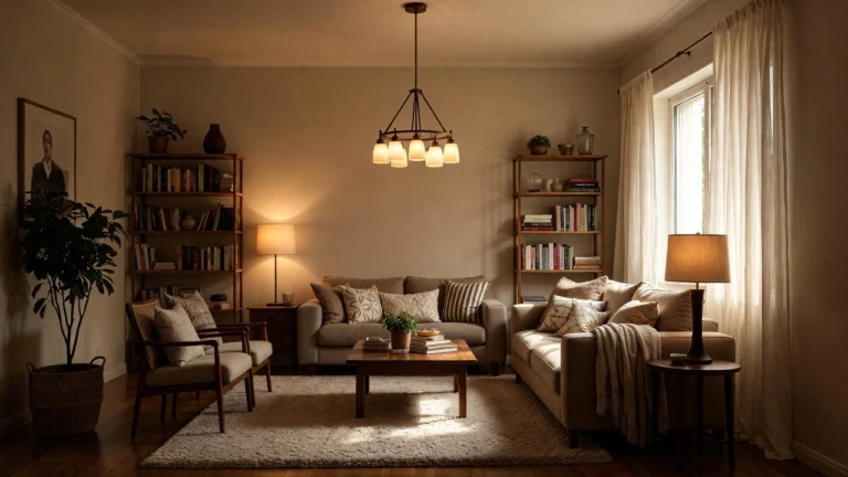
Uses shades next to each other on the color wheel, like sage, olive, and beige. Perfect if you want a soft, blended look without strong contrast.
Complementary Palette (High Contrast and Bold)
Uses colors opposite each other on the color wheel, like navy and orange or green and blush pink. Great for dramatic looks but use with caution unless you enjoy sensory overload.
Monochromatic Palette (Minimal and Classy)
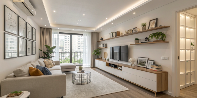
Choose one color and use lighter or darker versions of it. Think deep gray, medium gray, soft gray, and chalk white. Easy, stylish, and impossible to mess up.
Use Your Furniture as a Color Clue
Look at your existing pieces. If you already own a velvet emerald sofa or a light gray sectional, let that guide your color palette instead of fighting against it.
Ask yourself:
- Does my sofa have warm or cool undertones?
- Will my rug look washed out against pastel walls?
- Do I want my furniture to blend in or stand out?
If your furniture is neutral, you have more freedom. If it’s colorful, build your palette around it so everything feels intentional.

Neutrals Are Not Boring (When Done Right)
Let’s clear this up: neutrals are not just beige. Neutrals can be taupe, warm gray, driftwood, mushroom, stone, oatmeal, and so many more aesthetically pleasing names that basically mean “fancy beige.”
Why neutrals work so well:
- They provide a clean base
- They make bold accents pop
- They never go out of style (unlike that bright lime trend from 2014)
If you crave a minimalist aesthetic but still want personality, layer textures—linen, wood, soft throws, matte paint finishes—to prevent your space from looking like a hospital lobby.

Don’t Ignore Accent Colors—they Make Everything Come Alive
Accent colors are like spices—too little and it’s bland, too much and it’s chaos. The 10% accent color rule adds depth without overpowering your living room.
Great accent color combos:
- Sage + Gold + Cream
- Navy + Burnt Orange + White
- Beige + Olive + Brass
- Charcoal + Blush + Warm Wood
Quick hack: If your decor already has hints of a color, pull that color through pillows, art, or throws to make everything feel tied together.

Texture + Color = Designer Look Without the Designer Price Tag
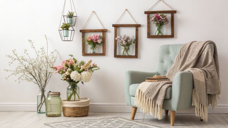
Sometimes you don’t need more colors—just more texture. A room drenched in one shade can still feel rich and layered if you mix matte paint, velvet cushions, ceramic decor, woven baskets, or metallic frames.
Texture ideas to elevate your palette:
- Velvet pillows in jewel tones for drama
- Woven baskets or jute rugs for earthy palette
- Brass or gold frames to warm up cool color schemes
- Glass or stone decor for a modern, sleek vibe

Test Before You Invest (PLEASE)
Never paint an entire wall without testing. I once painted a whole room in what I thought was “soft taupe” and ended up with what can only be described as “sad cafeteria oatmeal.” Don’t be me.
Do this instead:
- Paint a sample square on the wall
- Check it in morning, afternoon, and evening light
- Hold decor items against it to see if they match
- Take a photo—cameras show undertones the eye sometimes misses
FYI: Your phone camera might roast your color choice before your friends do.

Final Touches That Seal the Look
Once your palette is locked in, finish strong.
Final styling tips:
- Repeat your accent color at least three times in the room
- Add a piece of wall art that features all your chosen shades to unify everything
- Use plants to soften harsh color contrasts
- Balance bold walls with lighter curtains or vice versa
Conclusion: Your Living Room, Your Rules
At the end of the day, this is your living room—not a showroom. The perfect color palette isn’t about what a magazine recommends but what feels right when you walk in with a cup of coffee and flop on the sofa after a long day. Trust your gut, test your colors, and don’t be afraid to repaint if things go sideways. IMO, a well-painted wall is cheaper than therapy and almost just as satisfying.

